
You may not have heard the phrase 'responsive design' but chances are you have definitely seen it in action.
Mobile usage is on the increase and here at NB we are seeing many of our client's sites averaging around 50% of visitors using mobile phones or tablets to view their content. So what is responsive design all about?
What is Responsive Design?
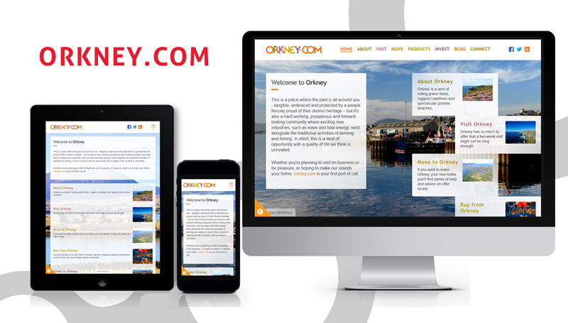
A responsive design is a website which automatically adjusts the size of the content to fit the viewers screen. If viewed on a desktop screen you see the full view of the site but if viewed on a smartphone or tablet the site will retract to fit the smaller display.
This avoids the need for separate versions of the site for mobile and desktop which reduces duplication and makes it much easier to manage your content.

Preferred by Google
Google prefers responsive designs because only one version of each page exists. This means it is easier for them to index all the content within a site and much easier for users to share. A social media link which has been shared on a phone isn't great for someone who clicks it on a desktop and vice versa.
Here at NB we have recently started receiving emails from Google warning us about sites which are not 'mobile friendly'. This means there is a possibility Google might start to demote these websites in search rankings compared to other similar sites to index all the content within a site and much easier for users to share. A social media link which has been shared on a phone isn't great for someone who clicks it on a desktop and vice versa.
Better Usability
From experience we know it is much easier to use a website which automatically adjusts to your display. With the rise in popularity of tablets and 'smart watches' starting to make a significant appearance in the market, now is an ideal time to make sure your website is totally responsive to these changes.

More engaging for Visitors
When looking at website data, we often use a measure called 'Bounce Rate'. Simply put, this is a percentage of users who land on a page and then exit it again straight away. This is a good indication of whether users are actually engaging with a website or getting fed up and looking somewhere else. Our recent analytics reports suggest that bounce rates are significantly higher on non-responsive websites than their mobile friendly counterparts. For an e-commerce site this means a huge difference in conversions and therefore sales.
Stay Ahead of the Competition
If you have the choice of two paths, one with a blockage and one with a clear route, which one would you take? That's what we all do when browsing the web. If something gets in the way of us finding what we want, we look for another path. If your competitors already have responsive designs for their websites and you don't, it's definitely time to look at making your site mobile friendly. If your competitors don't have responsive designs yet, you can get one step ahead by beating them to it!
I Like My Website. Do I Need a Complete Redesign?
No! Responsive design can be 'retrofitted' to your existing website so if you are happy with the content and visual element of your site it can still be adjusted. Some nifty coding additions and adjustments from our website boffins can give your existing website a new lease of life. For a more detailed rundown take a look at our responsive design infographic.