
“we’ll lead not merely by the example of our power, but by the power of our example”
Joe Biden, inauguration speech, January 21st 2021
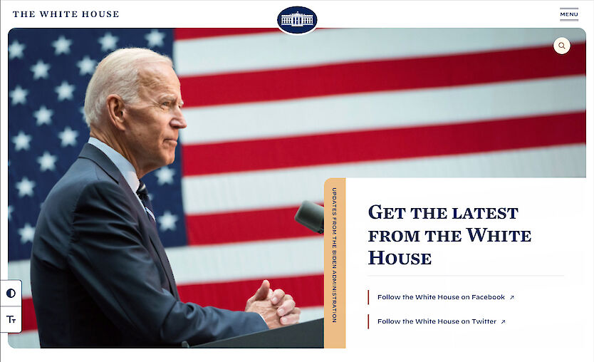
Minutes after Joe Biden was inaugurated as President the Trump era websites and social media accounts were replaced by the incoming administration.
As a website developer, the new White House website www.whitehouse.gov caught my eye.
 It’s an interesting case-study to look at for considering web-development trends and best practice. Does it lead by example? Let’s look at some of its notable features, and lessons we can apply to other sites.
Performance
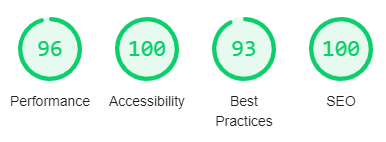
Good websites load fast, and the White House website is fast. Running the homepage through auditing tools shows it scoring well:
 The HTML for the whitehouse.gov homepage is delivered to my home computer, on a snowy hillside in Shetland, in an average time of approx 150 milliseconds. And the images appear very quickly thereafter.
One of the ways the site is achieving this is by using a Content Distribution Network (CDN). With a CDN, the website content is hosted on servers geographically distributed around the world.
The CDN used for the new White House website is Akamai. Akamai have servers located in more than 130 countries.[1] This means that when I load the website I’m most likely connecting to a server relatively close to me in the UK. This saves time compared to sending electrical signals all the way across the Atlantic to the United States and back. Another benefit is that if any of the servers are busy – making them slower to respond – the load can be spread among the other servers.
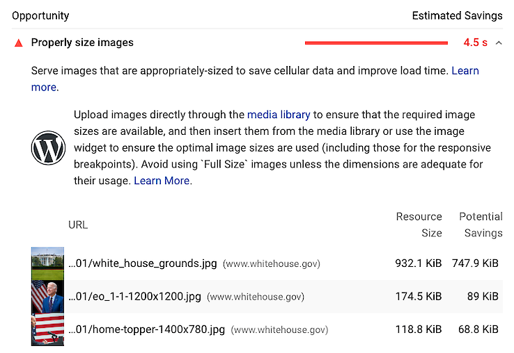
There’s always room for improvement, however. The most significant drag on the load time for the White House homepage is an image with an overly large file size:
Language switcher
When you’re trying to reach people it’s important to speak their language.
An estimated 41 million people in the US speak Spanish at home.[2] The President is also the head of state of Puerto Rico – a predominately Spanish-speaking territory.
The Trump administration were criticised when they removed the Spanish language section of whitehouse.gov on taking office in January 2017. In the first official press briefing of the administration, the then Press Secretary Sean Spicer implied the Spanish version was “just going to take a little bit more time” to add. But it never was.
Now it’s back:

Accessibility
Too often websites are hard to use or navigate, which is detrimental for everyone. It’s also ethically wrong when it excludes people from equal access and opportunity.
This is where web accessibility, and web standards, come in. The W3C explain:
“The Web is fundamentally designed to work for all people, whatever their hardware, software, language, location, or ability. When the Web meets this goal, it is accessible to people with a diverse range of hearing, movement, sight, and cognitive ability.”[3]
Disabilities affect more people than you might think. It is estimated one in four people in the United States has a disability of some kind.[4]
The new White House website is taking web accessibility into account.
In their footer they link to a short accessibility statement, which explains the White House’s “ongoing accessibility efforts work toward making WhiteHouse.gov as accessible as possible”. The statement makes mention of the current main standard for web accessibility: WCAG version 2.1, level AA. This standard is actually a legal requirement for websites in many situations, in different countries, including in the UK.
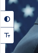 More unusually, the new White House website features a small widget in the sidebar which allows users to change the styling of the site. Specifically, it allows users to toggle large font size and/or high contrast modes.
The high contrast dark mode I think is a nice feature.
I’m sceptical however about the benefit of accessibility ‘toolbars’ on most websites. I’ve noticed they tend not to be used on sites where it’s obvious a high level of attention to accessibility has been applied.
For example, in the UK:
Why not? Most of the features are redundant. A website should have suitably sized fonts and colour contrast by default – a toolbar won’t fix that. And users are accustomed to using their browser’s own built-in assistive features to go further when needed. For example, to zoom-in, resize text, or read text out loud. Inconsistent implementations of these features on individual websites can be more of an annoyance than a help.
On the White House site, I notice the widget sometimes gets in the way. It partially obscures content depending on your screen size:
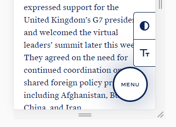
That being said, the White House’s simple accessibility widget is one of the better ones I’ve seen. And better, in my opinion, than automated third-party toolbars sometimes added to sites.
Inclusivity
Something included on the White House site, which I’ve rarely noticed on other sites, is an optional field in the Contact Us form asking the user for their preferred pronouns:
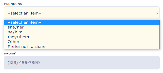
Giving the user the option to specify their preference makes it easier to ensure they’re addressed professionally and respectfully in subsequent correspondence.
Note – the form isn’t asking for the user’s gender, which is unlikely to be needed for standard contact form enquiries.
Hidden message
There’s a message hidden in the website’s code, which was picked-up and reported on by the press:
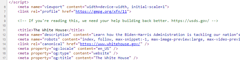
The comment reads, “If you’re reading this, we need your help building back better”, and includes a recruitment link.
A nice advertisement for the US Digital Service.
Technology stack
My eyebrow raised a little on seeing that the site is built using the WordPress content management system.
WordPress doesn’t always enjoy the best reputation among some web developers, myself included, who would argue there are better options available for most types of websites.
WordPress is however a mature, battle-hardened, platform, with many good points. It’s the most popular content management system by market share.[5] A lot of negativity I think is due to WordPress being mis-used over the years, and the variable quality of the huge number of third-party themes and plugins.
Peeking in the source code of the White House website we can see the developers have also taken a traditional approach to the front-end code. For example, making use of the old-school jQuery library, rather than following some of the latest fashions. Simpler is often better for reliability and speed.
A final thought
The most important aspect of a website is always the content. For many, the best and most important aspect of the new White House website will of course be the radical change of content!
If you would like to discuss how your own website could benefit from the techniques and ideas discussed above, please get in touch.
[2] U.S. Census Bureau, 2017 American Community Survey
[3] Centers for Disease Control and Prevention Infographic
[4] W3C Introduction to Web Accessibility
[5] W3Techs Usage Statistics and Market Share of WordPress, February 2021