
Which of the countries left in Euro 2016 is winning online?
We are really enjoying this summer's Euro 2016 football tournament and, even although Scotland didn't qualify, we are looking forward to seeing which country is going to win in the end. It is impossible to call at this stage, just before the 'Round of 16' matches commence. The big countries are all still there, but there are plenty of underdogs dreaming of emulating Denmark or Greece from the recent past (or even Leicester City's unexpected win in the English Premier League just a few months ago). Can Iceland go all the way? Can Gareth Bale power Wales to victory? Will England's young team finally click and triumph in a major tournament for the first time in 50 years?
We have no idea who will win the football tournament, but we figured it might be a bit of fun to look at the official destination marketing websites of the 16 remaining countries to see who is winning online.
To begin with, the head-to-head contests in our 'Round of 16' exactly match the ties from the football tournament. But, of course, the ties in the next rounds are likely to be different.
In the Round of 16, our reviews were based on asking one simple question: after visiting both websites, which country do we feel most inspired to visit?
So, we didn't explore any of the sites in great detail, and certainly didn't undertake advanced technical analysis of any sort. (We'll do this in later rounds, though). In this round we were simply interested in seeing which sites created the most favourable initial impression. This might seem harsh, but this simply mirrors how websites visitors behave in real life. You only have one chance to make a first impression.
Note: we'll update our results here to the same schedule as the matches in France.
 Iceland (visiticeland.com) Analysis: The Icelandic site is immediately eye-catching. It looks very nice. The design is really clean with an attractive hero image highlighting some of the country's beautiful landscapes. The website features a useful and very simple to use 'search' option, which appears as soon as you land on the homepage. This works well and allows users to find tailored recommendations for things they'd be interested in when visiting Iceland.
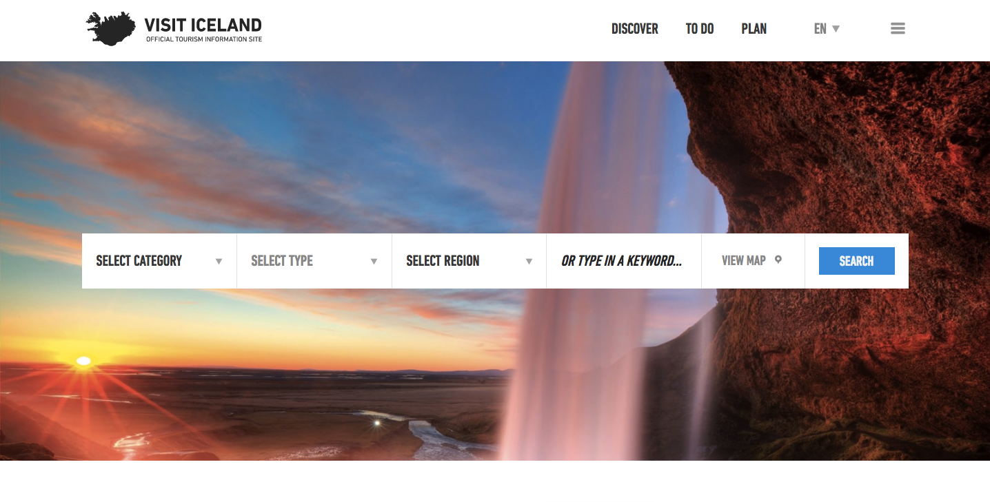 Exploring the site's internal pages leads to lots of compelling and well presented content, and the mobile version of the site works every bit as well as the desktop version. Perhaps our only gripe with the Icelandic site is its rather small main menu text after you click on the hamburger menu, but it's only a minor point in an otherwise very strong effort.
Site: VisitIceland.com
England (visitengland.com) Analysis: The English may be a little unlucky here. Their website really isn't bad at all (except for the image-based buttons overlapping larger images and looking messy - something we've seen too much of in this tournament already. However, they're quite unfortunate to come up against an opponent who had a site that made such a good initial impression.
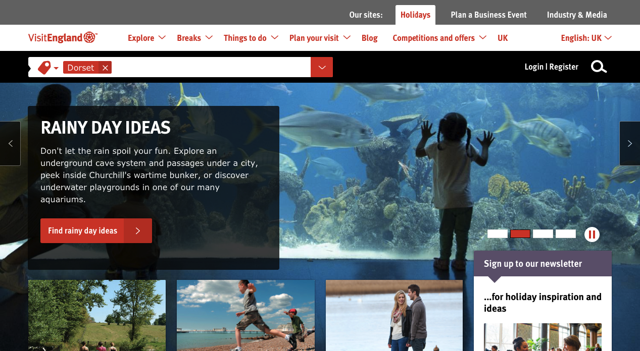 The Visit England site for the most part is very competent and makes good uses of photography throughout. The content is well written and informative, and the website is as good on mobile as it is on desktop.
Site: VisitEngland.com
Result: Tough luck for England, by no means a bad website and in any other match up would likely have made the quarter finals. Iceland look like early favourites for the title following such a strong immediate impact.
 Spain (spain.info) Analysis: Their football team are known for their stylish 'tiki-taka' football, but their website is the complete opposite. It is clunky and messy and just generally not very user-friendly.
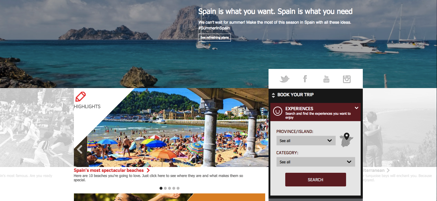
The call-to-action buttons appear to be very small, at least on our browser, and this doesn't help when trying to navigate further through the site. The 'Book Your Trip' section, while a useful addition, is poorly placed on top of a carousel of links and just confuses the user further.
Perhaps this website's only saving grace is that it is mobile friendly, but this site is going to struggle in this competition.
Site: Spain.info
Italy (italia.ie) Analysis: A really disappointing match up this, as the Italian site is even worse than the Spanish. It's straightforward enough to use and navigate, but the design is in dire need of a refresh.
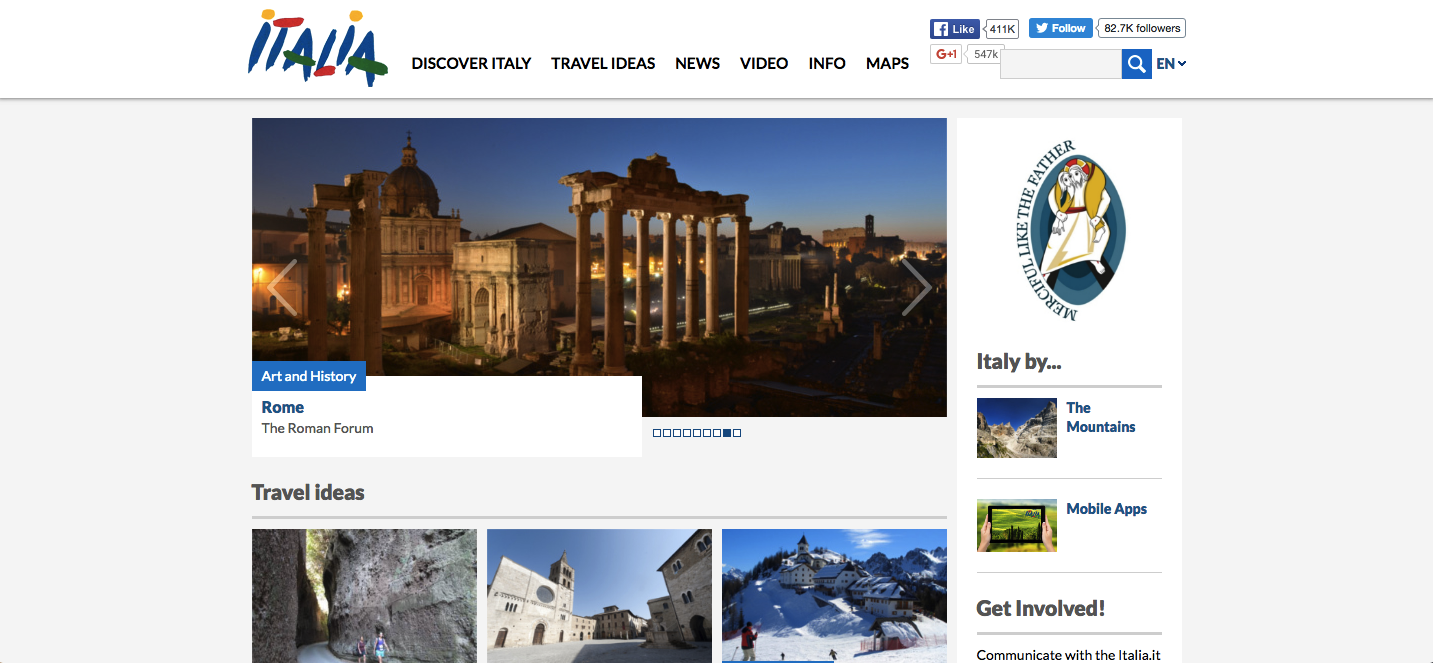
It doesn't get any better on mobile, as unsurprisingly, this dreadfully out of date website does not respond well on smaller devices.
Site: Italia.ie
Result: Footballing heavyweights, but two poor websites. Spain edge it on mobile-friendliness but are going to struggle in the quarter finals:
Spain Wins!
 Hungary (gotohungary.com) Analysis: Nice looking desktop site with large stunning imagery for an immediate impact. The site uses a very simple navigation system which leads to lots of compelling content and great images, all enhancing the country as a tourism destination.
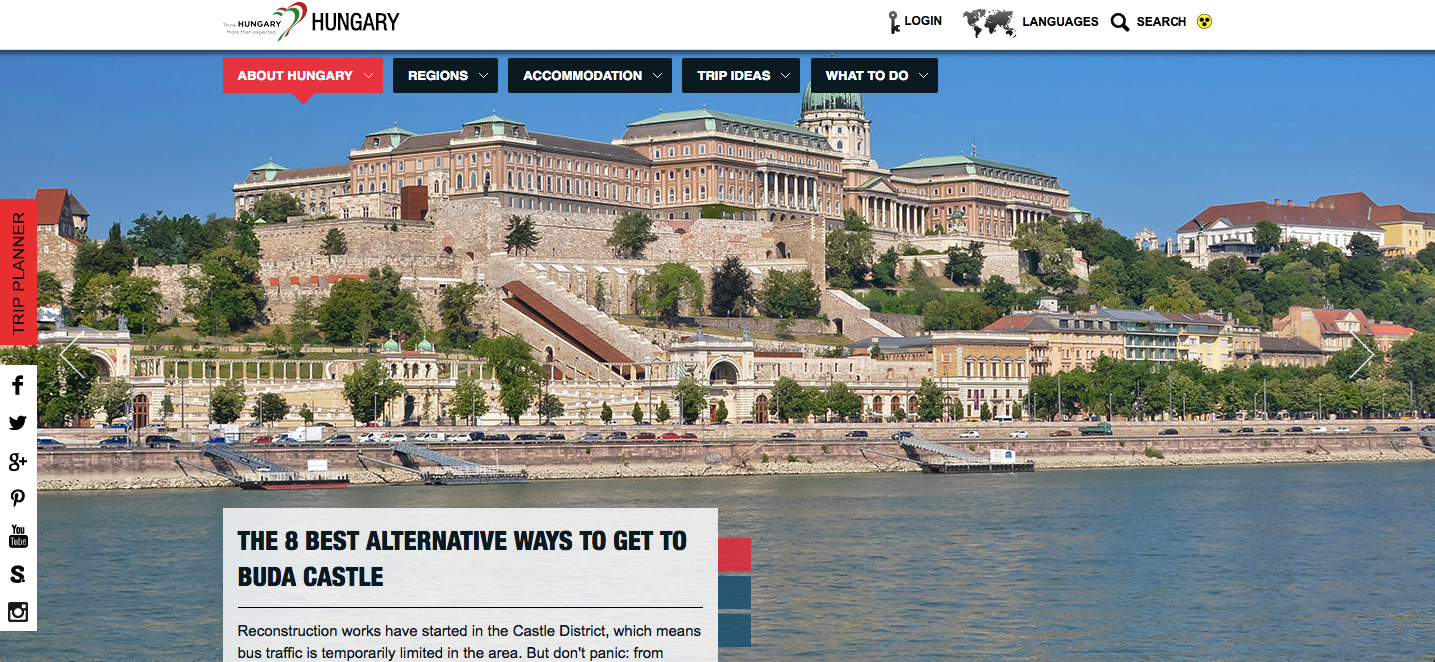 The only real weakness with the Hungarian site is its mobile version, which is non-existant. It is a frustrating experience to use on smaller devices, and this may give the Belgians the chance to take the lead...
Site: GoToHungary.com
Belgium (visitbelgium.com) Analysis: The Belgian football team come into Euro 2016 as FIFA's highest ranked European side (only Lionel Messi's Argentina keep them from the #1 spot). Unfortunately their website hasn't been on such good form. In fact, it is awful.
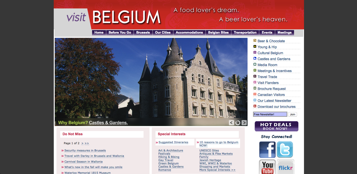
The site is terribly dated, not mobile friendly and simply doesn't do a good job of inspiring visitors to Belgium.
Site: VisitBelgium.com
Result: No contest.
Hungary Wins!
 Slovakia (slovakia.travel) Analysis: The Slovakia site is okay, but that's about it. It is generally quite clean and easy to use, but its centred design instead of a full-width one is rather dated in 2016. Some of the hero images are badly Photoshopped and look quite cheesy (you've got to think the Slovakian tourist board could have found 3-4 decent photos of their country without them having to be edited heavily!)
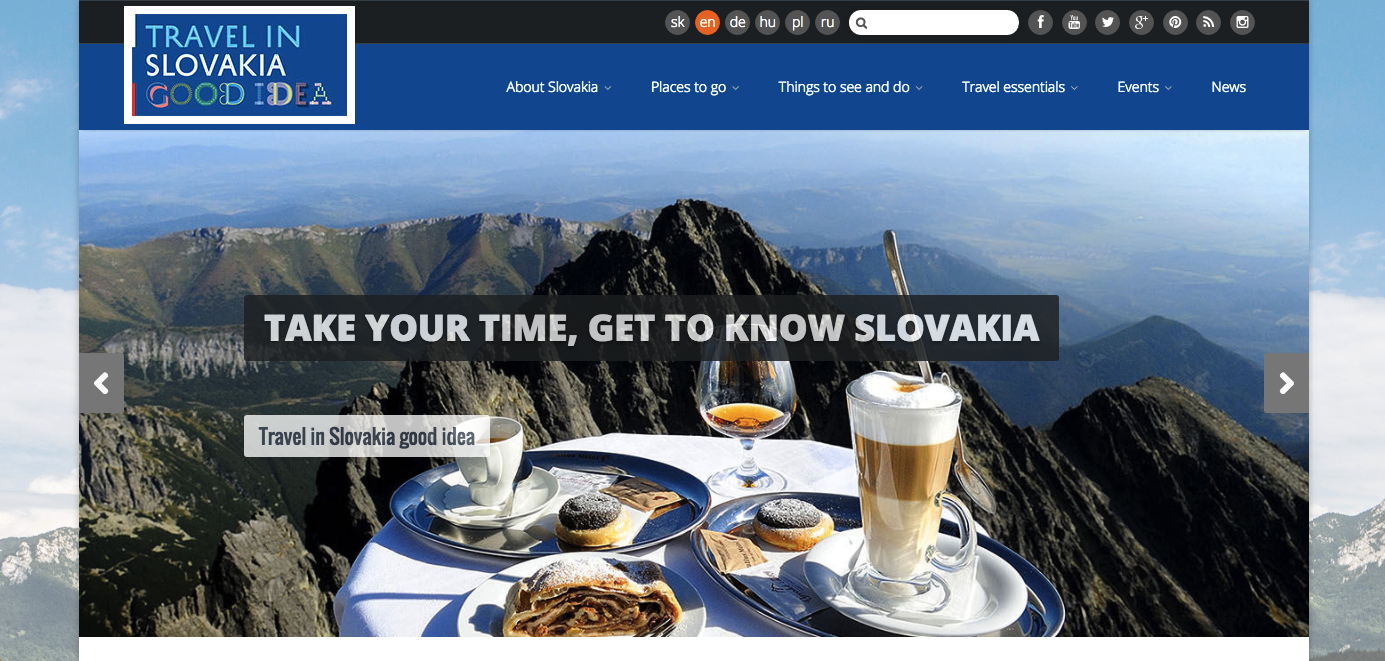
The actual content all looks pretty useful and is easy to find, and the site is mobile friendly which gives the Slovakian effort a boost. Overall it is not hugely inspiring, but also not the worst in the competition.
Site: Slovakia.travel
Germany (germany.travel) Analysis: Having checked out the German desktop site, we weren’t too impressed with the design or experience. There are way too many boxes on the landing page that doesn’t make the experience very engaging. It is difficult to know exactly where to look! Larger but less images could work so much better. You could argue the box layout serves its purpose, but a more interactive and engaging landing page would really entice us to dive deeper into the site and explore.
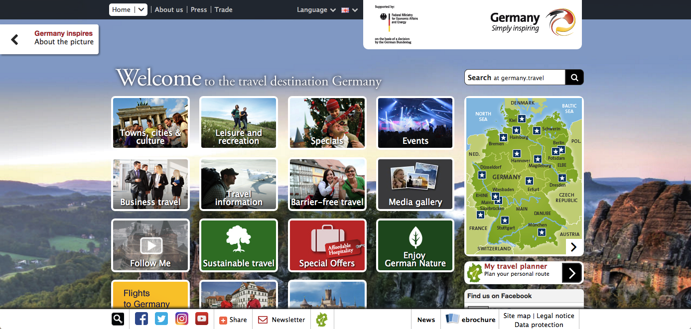
We had a surprise when we opened Germany.travel on mobile and found that it offers a completely different experience and is packed full of useful and engaging content. This includes drop down options and sliders that allow us to navigate to areas of the site not available on desktop. It responds well and really does deliver more impact than the desktop alternative. With more traffic now coming from mobile than desktops than ever before, it is good to see that Germany have at least covered this basis. They need to up their desktop game though.
Site: Germany.travel
Result: The Germans are effective on mobile, but score an own goal by not sorting their desktop site. By no means a classic enounter but the Slovakians sneak through:
Slovakia Wins!
 France (france.fr) Analysis: The first thing you notice when landing on the French site is images. There are loads of them and they are used for everything. There is a hero image on top of a background image, and these are connected to a large navigation section made entirely of images. Destination marketing sites should definitely use stunning photography to highlight how great a country is to visit, but this is just a little overwhelming!
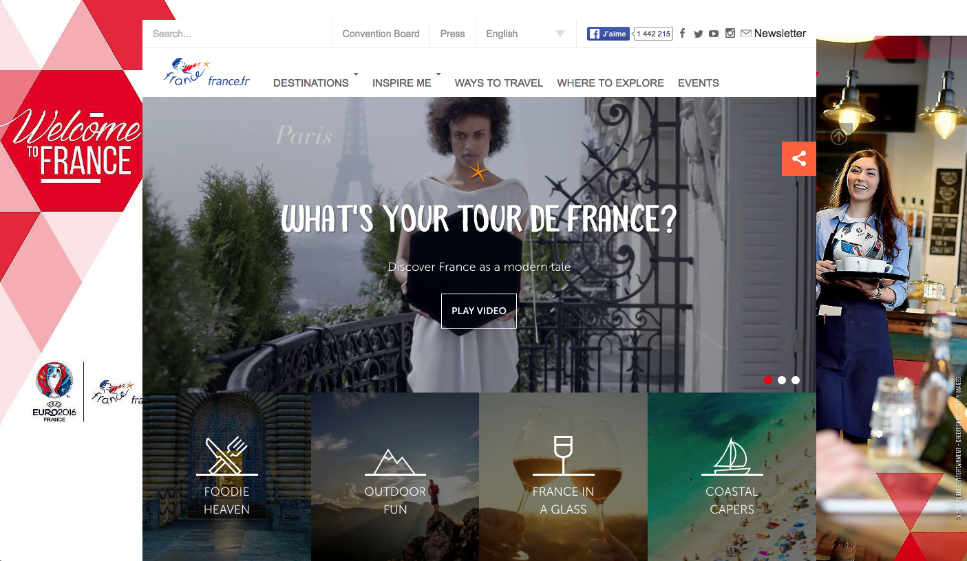
Some of the most essential information on a destination website is guides to the areas of that country. Annoyingly the French site doesn't have its own information for the different regions of France, and instead links out to each area's specific destination marketing website. This is fairly frustrating for anyone who hasn't decided which part of France they'd actually like to visit, as it could mean having to navigate away from the main site up to ten times.
Finally, the image-heavy design of the site actually works reasonably well on mobile devices, but probably isn't enough to salvage the tie for the French.
Site: France.fr
Republic Of Ireland (ireland.com) Analysis: Not a good start for the Irish. The first thing that appeared when we landed on their page was a large error message. The 'Things To Do' call to action also looked a little out of place, which is presumably down to the same error.
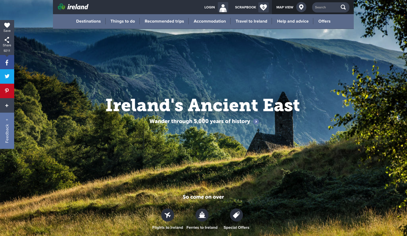
Anyway, we revisited the site for a second time and it appears to be working again. It turns out that the Irish site is quite nice, with informative internal pages which make good use of photography to showcase the country. Its navigation is very easy to use and allows the visitor to learn a great amount about what the country has to offer. A quick glance over the site on a mobile strengthens Ireland's efforts further as it responds very nicely.
Site: Ireland.com
Result: After a shaky start, the luck of the Irish prevails upon a second viewing, and this is enough to see them into the quarter finals:
Republic Of Ireland Wins!
Portugal (visitportugal.com) Analysis: First impressions - it's quite nice! Their football team may rely heavily on one player, but the website has quite a few nice touches. It features some eye-catching images showcasing the nation's beautiful cities and beaches. The navigation is simple to use, allowing visitors to easily and quickly find the information they are looking for, and the block layout further down the homepage is clean and should respond well on mobile devices.
The site should respond nicely, but this is where Portugal's weaknesses are exposed - it doesn't respond at all. Trying to use the Portuguese website on your mobile phone is almost as frustrating as watching Cristiano Ronaldo blaze his 20th free kick in a row over the crossbar. Can Croatia capitilise on this glaring error...?
Site: VisitPortugal.com
Croatia (croatia.hr) Analysis: The Croatian performance is a bit all over the place. There is quite a lot to like about this website, but it is not without its problems too.
The intro video instead of using static images is a nice touch, although sometimes these things can get annoying. However, we think here it does a good job of showing off Croatia as a vibrant place to visit, no matter who you are or what you want to do on holiday.
The site's design arguably gets a bit too busy below the fold, with all sorts of fullscreen images and fancy effects being used. Sometimes a bit of white space to separate elements of the design doesn't go a miss!
The website does make good use of social media though, pulling in an attractive and dynamic Instagram feed, allowing visitors to see different photos of the country every time they visit the site.
With the match set to go to the wire, we checked out the Croatian site on our mobiles, to find it is responsive. It is not without its problems, for example - the menu text lacks padding looks a bit off, but it's still a much more pleasant user experience than the Portuguese site on the same devices.
Site: Croatia.hr
Result: Croatia grab a winner by virtue of their mobile-friendliness:
Croatia Wins!
Wales (visitwales.com) Analysis: The Wales site is pretty nice with a clean design, and it works nicely on mobile too. However, the large homepage image didn't really inspire us that much. It shows a calm lake, and it is nice enough, but it didn't really make us go 'wow'. The #FindYourEpic campaign is initially a bit confusing, too, and generally the site didn't quite grab our attention as well as it could have.
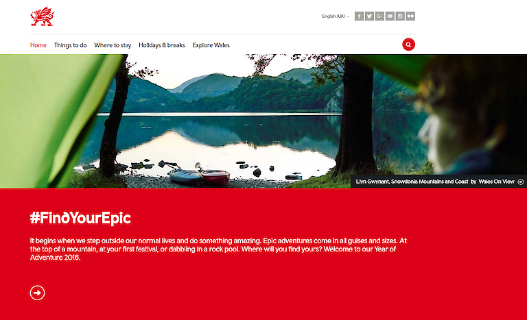
Site: VisitWales.com
Northern Ireland (discovernorthernireland.com) Analysis: The Northern Ireland site looks a little dated, with a lot of content crammed in to a small space, particularly given the relatively narrow main content area. That said, the main navigation system provides immediate access deep into the site, as does the homepage carousel. However, a major drawback of the site is that it hasn't been optmised for use on mobile devices, and it is fairly horrible to use on small screens.
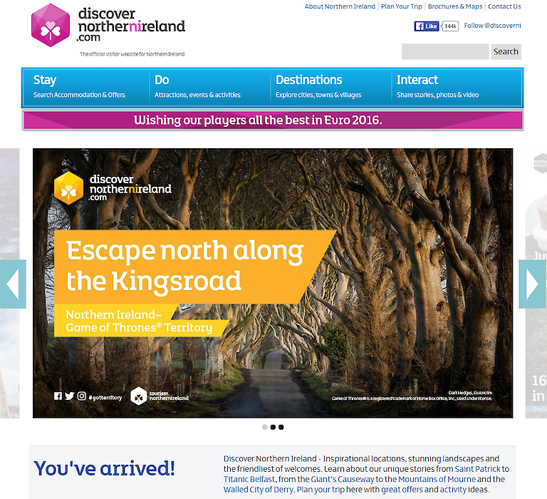
Site: DiscoverNorthernIreland.com
Result: Content wise, there is not a huge amount between the two sites. However, anyone attempting to use the Discover Northern Ireland site on a small screen is in for a poor experience, and this is the deciding factor.
Wales Wins!
Switzerland Analysis: Not the worst destination marketing website we've ever seen, but first impressions are that the homepage is very busy, with chat and booking widgets popping up immediately. We're not saying that these aren't useful, but they don't look particularly great. Surely the homepage would have a much bigger impact if it featured some stunning images of the Swiss Alps rather than a small carousel mostly obscured by text, buttons and a logo.
We checked out myswitzerland.com on our mobiles too, and found that it responds well enough but, like the desktop version, it just lacks a bit of impact.
Overall, the Swiss website, much like their football team, is solid, but lacks the flair to really set the tournament alight and is unlikely to make it much further than the early knockout rounds.
Site: MySwitzerland.com
Poland (poland.travel) Analysis: There's not a lot to choose from between the Poles and their opponents in this match-up. In fact, there's a great deal of similarities between the two. We feel like this site could have made a bit more use of larger homepage images to really sell the country.
The site does have some nice large and easy to use navigation buttons though, which we like. It clearly helps the user find exactly what they want to do on the site upon arrival. The Poles fare slightly better than their Swiss opposition when the websites are viewed upon mobile devices. This one, while still not hugely exciting, does make better use of imagery and carries across the effective navigation process from the desktop version well.
Site: Poland.travel
Result: Not much to pick between the two sides, but the slightly better Polish mobile version snatches it: