
The Final Four
In our last post we evaluated the eight websites which made the best initial impression on us in the previous round. In a murky digital world which is dominated by social media and content marketing, we narrowed these down to four by analysing how well each country were performing when it comes to bringing visitors to their websites. The results were as follows:
Poland v Croatia
Wales v Hungary
Slovakia v Spain
Republic Of Ireland v Iceland
That leaves our semi final line up looking like this:
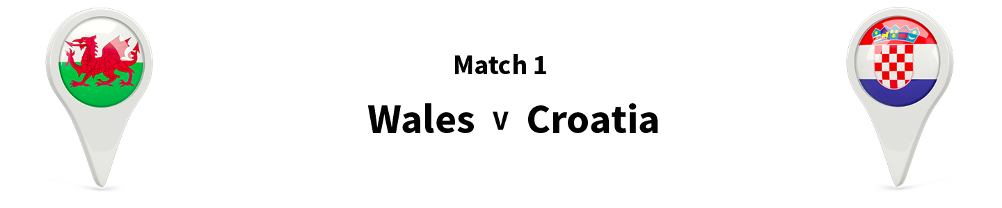
Wales v Croatia
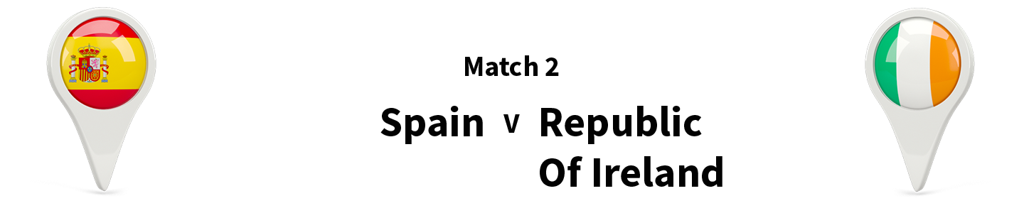
Spain v Republic Of Ireland
The Semi Final Criteria
If the quarter finals were based on how well websites attract visitors, it only makes sense that the semi finals are based on how well these websites convert visitors into taking relevant action. We're going to judge each of the last four websites on the content they have on their websites and how well written and compelling it actually is. We'll also be looking out for how these websites convince a visitor to take action. Do they have bold CTA (call to action) buttons? Is there a mailing list sign up to capture contact details? Are they trying to be creative when convincing visitors to take action (e.g. holding competitions)?
Spain (spain.info) Analyis: We've not been particularly impressed with the Spanish website throughout this tournament, but a combination of weak opposition and luck with the criteria in certain rounds, here it is in the last four. We've been critical of the Spanish website design in previous rounds, and again, it doesn't really do anything to help convert visitors.
Frustratinlgy, the Spanish do make some attempts to achieve converstions in the way we'd like a destination marketing website to do, but there are little to no call to actions, and the links to these things are hidden away. You can access a mailing list sign up, which gathers details, by clicking on a link in the smaller and less prominent menubar at the top of the page. They should really have a version of this form in an obvious place on the homepage.

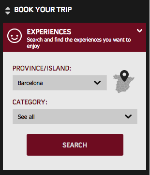
Credit where it's due, the site does feature a prominent 'Book Your Trip' section which is instantly visible upon landing on the homepage, and this automatically gives users the option to take immediate action.
Republic Of Ireland (visitireland.com) Analyis: Unlike the Spanish, we've been consistently impressed with the Irish throughout. They've got their conversation tactics pretty spot on in these semi finals too. The website immediately promotes call to action buttons for booking flights and ferries as soon as you land on the homepage, allowing visitors who definitely want to visit the country to commit to booking quickly.
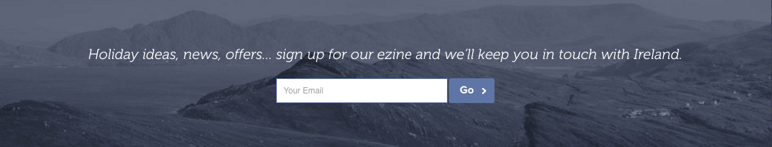
Further down the homepage, there is a clear newsletter sign-up gathering email addresses, and this option is repeated in the website's footer, meaning it will appear on every page.
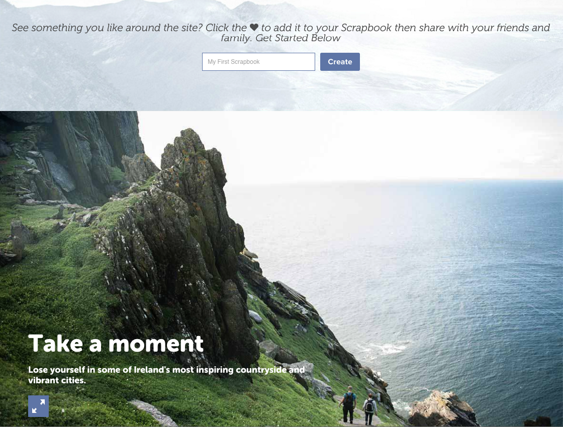
 Their 'scrapbook' feature is clever too, as it allows visitors to mark things they like around the website with a heart icon, meaning they can easily come back to the site and read that part again later. By doing this, the Irish have created a way to keep people coming back to the site time and time again.
Result: Spain have the right idea but their execution is poor, while the Irish are clinical with their conversion attempts.
Ireland Wins!
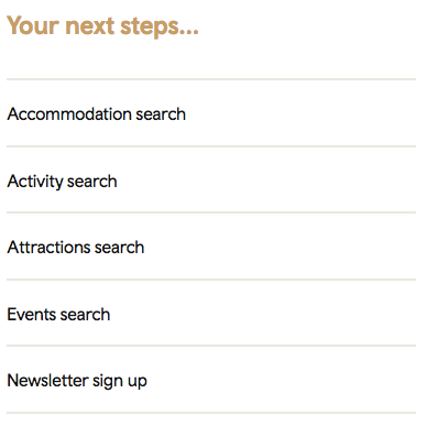
Wales Analysis: Just below the fold on the Wales page, we came across a section called 'Your Next Steps...' This is exactly what we're looking for. It could arguably be made to stand out a bit more though. However, by having this section, the site is right away asking you to take the next step in considering Wales as a potential tourist destination. For those who are absolutely set on visiting the country, there is an 'Accommodation Search' option. In addition, there is the option to request a holiday brochure, which again, you probably wouldn't do unless you were seriously considering a trip to Wales. They may have missed a trick by not asking for an email address in exchange for the brochure, but it's not a huge problem as right below that, they do have a mailing list sign up option. This will allow VisitWales to gather an extensive list of email addresses from people who have expressed an interest in visiting and they'll be able to contact them on a regular basis with news and offers amongst other things.
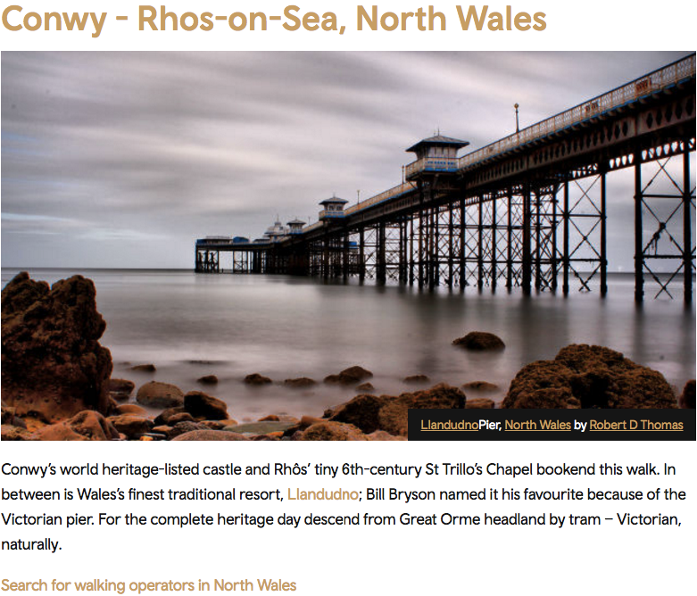
We've already been impressed with the Welsh site earlier in the tournament, and when digging into their content a bit more, we're pleased to see that it is quite strong, and crucially always has a call to action. For example, on the 'Coastal Heritage Walks' section, they've provided links to tour operators for those who may want to place a booking.
Croatia (croatia.hr) Analyis: There is no real obvious call to action on the Croatian homepage, apart from maybe encouragement to download their app. If the aim of the website was to promote an app, this would be fine, but the aim of this website is to bring tourists to Croatia. By making them download an app, you're just asking them to take more steps without making a definitive decision on whether they want to visit the country. Saying that, anyone who does download the app could then potentially be available to receive push notifications on their mobile device, so in a long-winded way, the Croatians have a way of reminding people that their content exists and prompt them to check it out. At this stage though, we feel like they may be better off trying to push something like a mailing list, which would require much less effort on a visitor's part, especially if they have just landed on the site and are only in the early stages of considering Croatia to be a destination they'd like to visit.

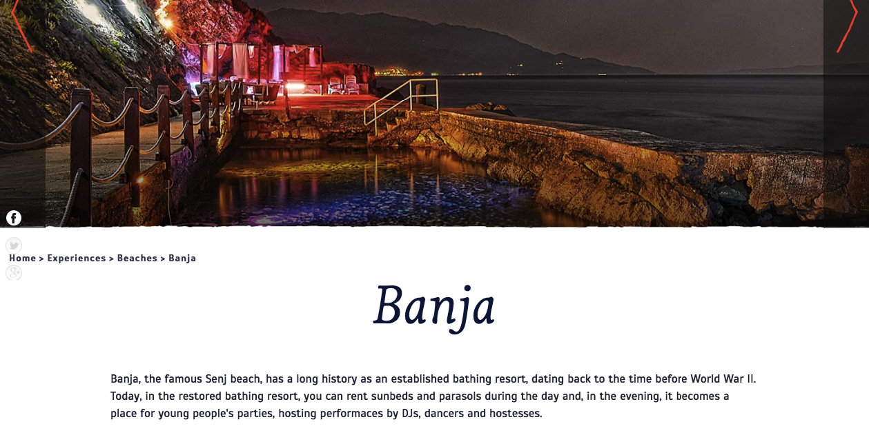
We dug a little deeper into the website to have a read through some of the content they've produced, to see how well it would do in converting NB staff into tourists of Croatia. They cover a lot of ground with a huge list of activities and sights avaiable to see and do in the country, and they break it right down into detail often. For example, every beach has a gallery of good images and an accompying paragraph of simple descriptive text. The large map section also allows the visitor to clearly see where the attraction or activity is based within Croatia. We could make an argument for some of the content to go into more depth in places however. For example, on their 'Cycling' page, how about a few actual route plans for those who are serious about biking accross Croatia? All of the content has been handily translated into 15 different languages.
The biggest let down with the Croatian site is that once you've read the content, other than downloading the app, there isn't a whole lot left to do. The lack of a mailing list sign up or even clear contact details make it difficult for people to get in touch and learn more.
Result: Wales have got all the basis covered and from our point of view have a better understanding than the Croatians at what is required to convert a visitor.
Wales Wins!